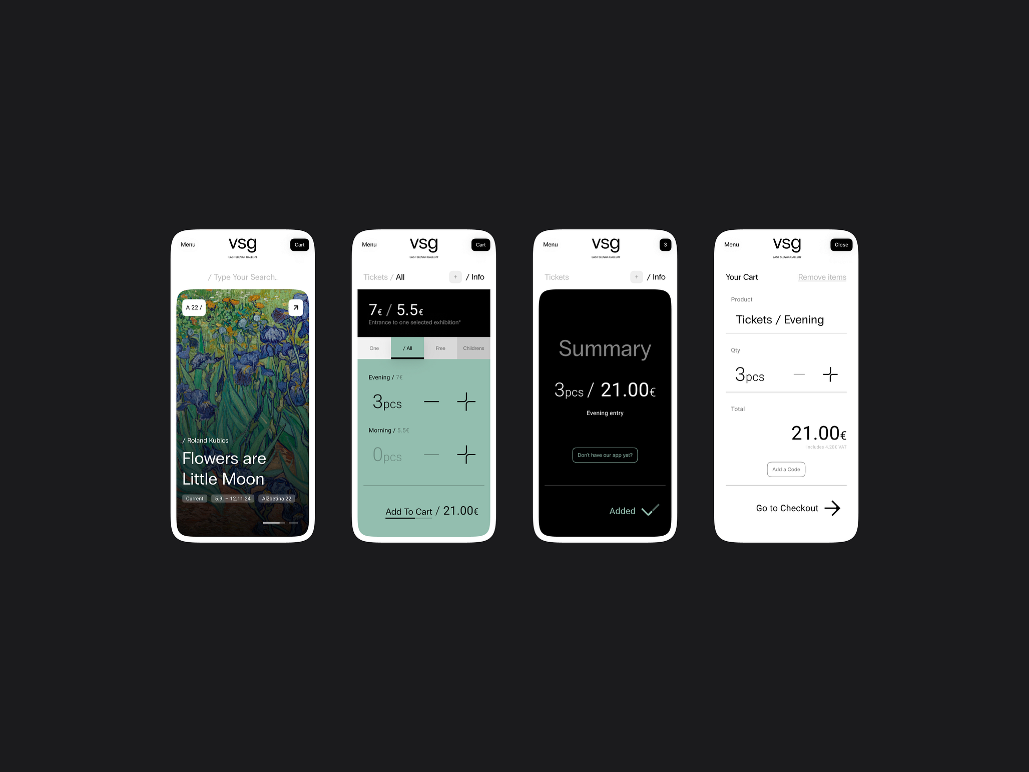
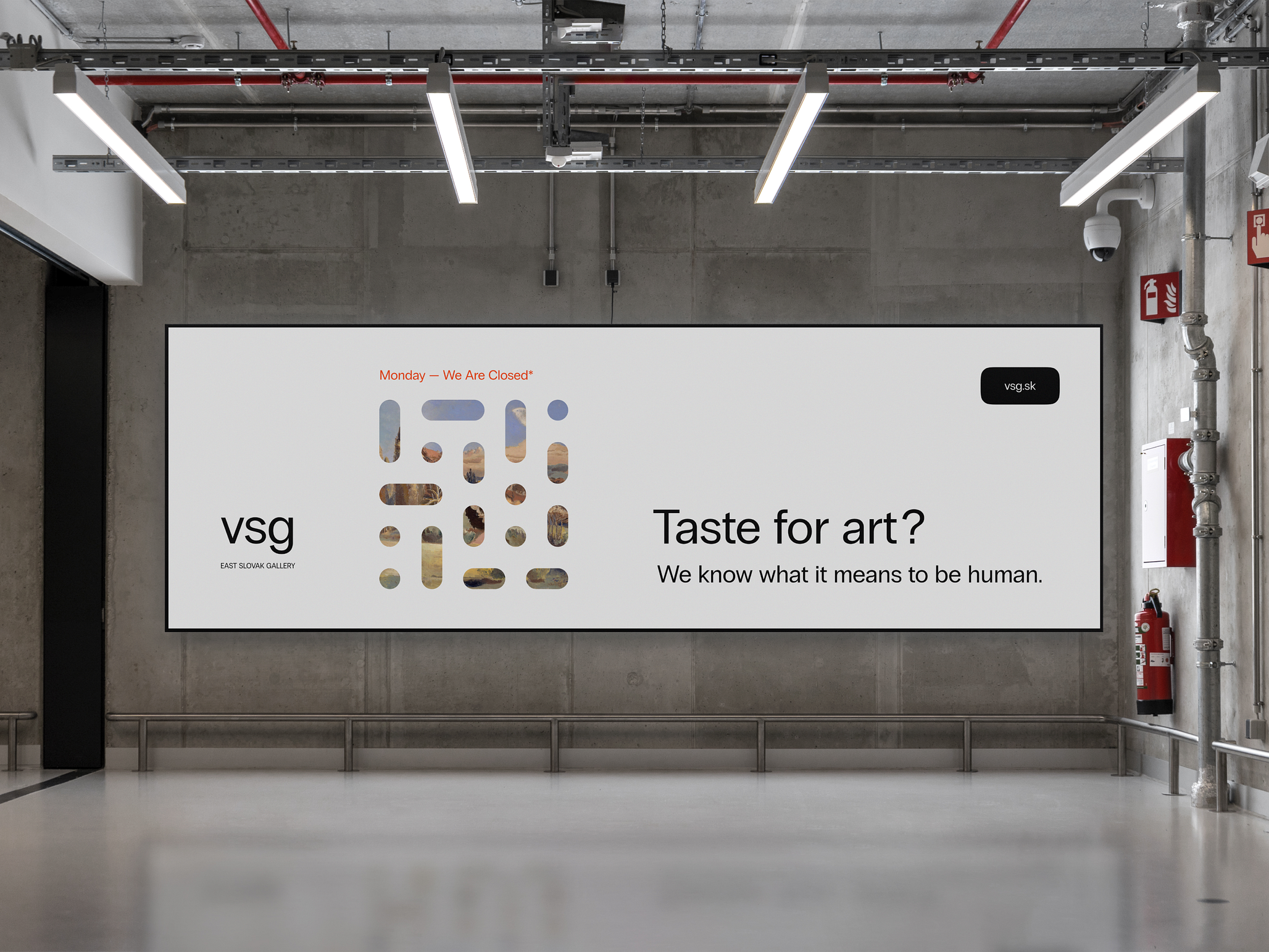
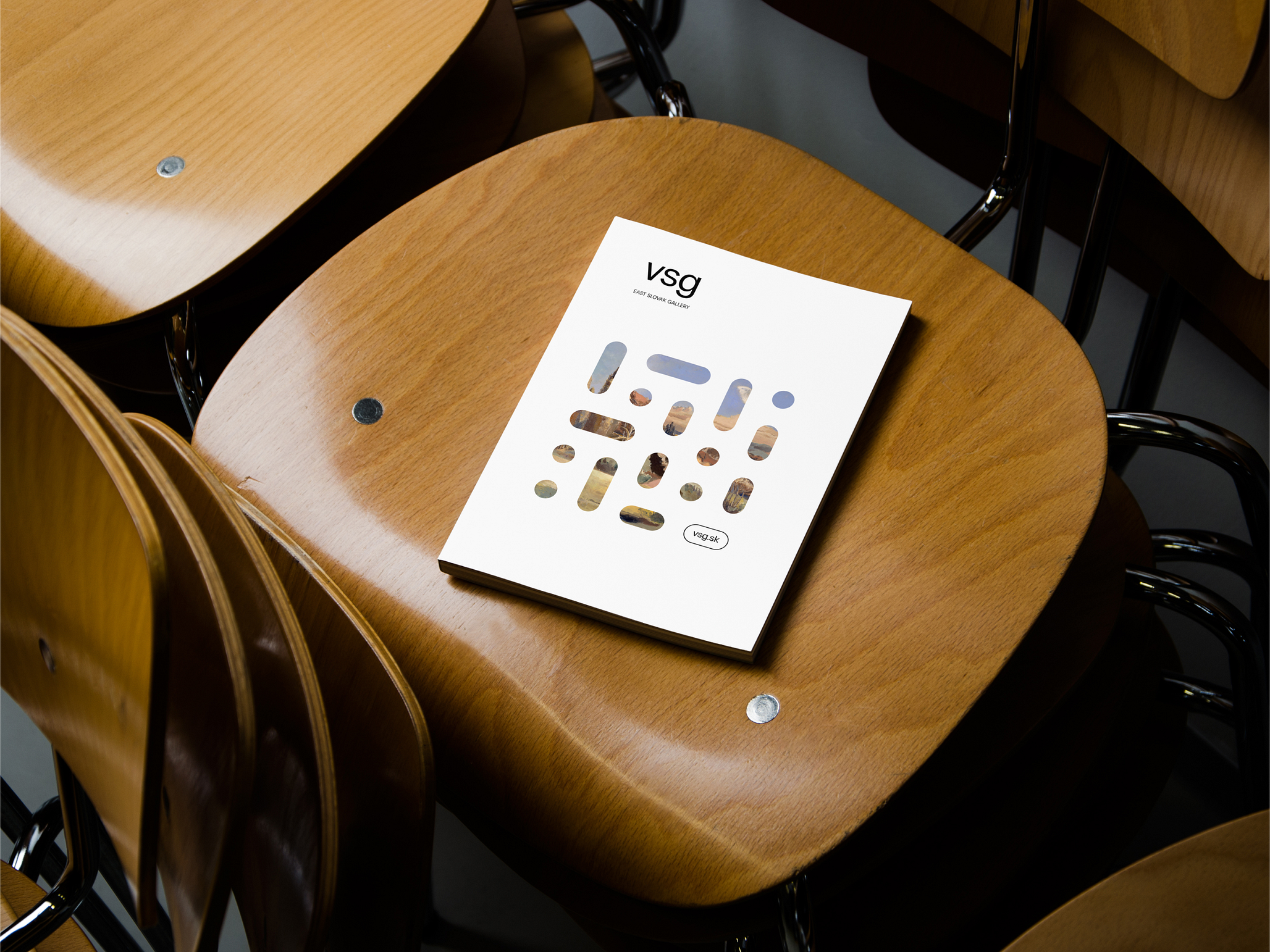
As part of our next concept, we focused on the redesign of the East Slovak Gallery, with the aim of creating a modern and visually attractive space that will appeal to young visitors. We combined elements of traditional art with contemporary design trends to create a concept that is not only functional but also aesthetically impressive.
Design that will attract the young generation
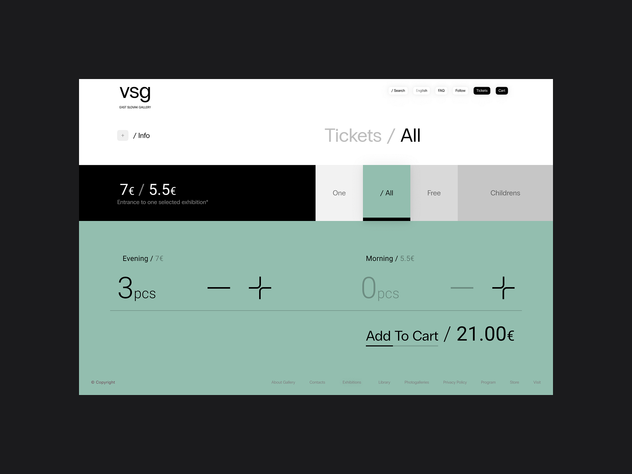
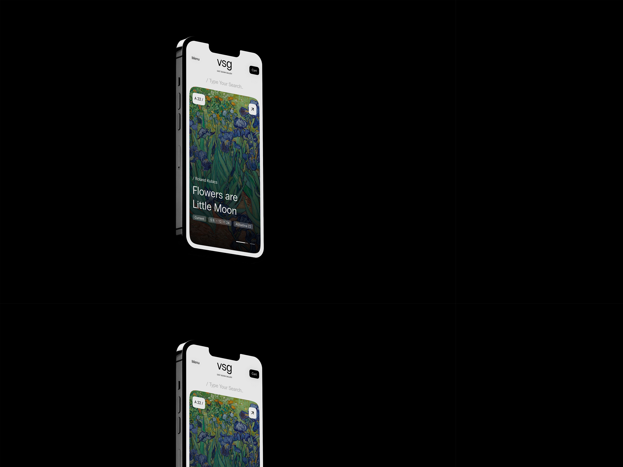
Our design builds on a minimalist foundation where clean lines and simple color schemes allow the art to stand out. We used modern typography and an innovative layout that support easy orientation and a pleasant user experience. Interactive elements and responsive design ensure that the gallery website is equally effective on all devices – from desktop to mobile.
Innovations in marketing materials
Our redesign also includes new marketing materials that reflect modern aesthetic values and at the same time preserve the spirit of the East Slovak Gallery. We have created concepts for tickets, brochures and promotional materials that not only inform, but also inspire a visit. These materials are designed to appeal to a wide audience, but with a special emphasis on the younger generation, who are looking for cultural experiences in a contemporary and modern design.
Friendly user experience
When designing the website, we emphasized intuitive control and simplifying access to information. Visitors can easily find information about current exhibitions, purchase tickets or explore the gallery’s collection online. The simple and clear design makes browsing a pleasant experience, whether it’s planning a visit or just browsing the latest from the gallery.
Design concept by Marek Turčok


